
Flexfit 110: Hybrid
Brand Strategy | Visual Identity | Graphic Design
Challenge
Launched in 2013 as the “comfort” cap that fits 10 sizes and everything in-between, the Flexfit 110 was lacking a strong differentiating messaging and visual identity. As a result, most customers did not understand the cap’s unique value proposition and assumed it was just another Flexfit cap. Flexfit needed to find a way to help customers intuitively understand the innovative technology that went into creating the Flexfit 110.
Solution
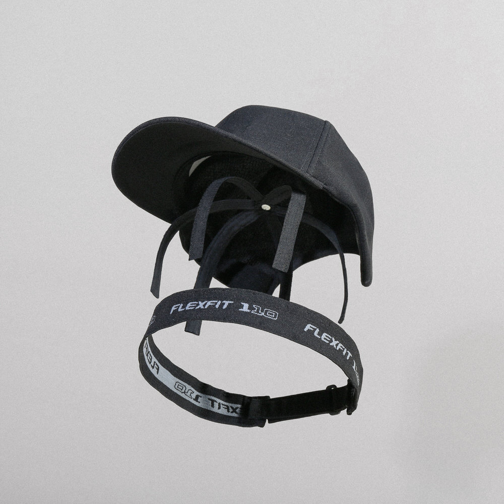
Through research, we determined that the Flexfit 110 was quite “hybrid” in nature. The cap combined Flexfit’s signature stretch-sweatband with an adjustable closure to create an extremely personalized fit. Additionally, market studies revealed that fitted stretch-sweatband caps were perceived as solely performance-oriented while adjustable caps (snapbacks, dad caps) allowed stylish expression, but compromised on performance. With a growing demand for versatile “athleisure” apparel, it made sense to position Flexfit 110 as a “hybrid” cap that combined the best of both worlds; stretch fit + adjustable closures, performance + style. With this new idea, we created a visual identity that combined urban textures with deconstructed tech-spec illustration styles. This new identity enabled us to visually educate customers on the innovative components that made up Flexfit 110.